
Orenda Force
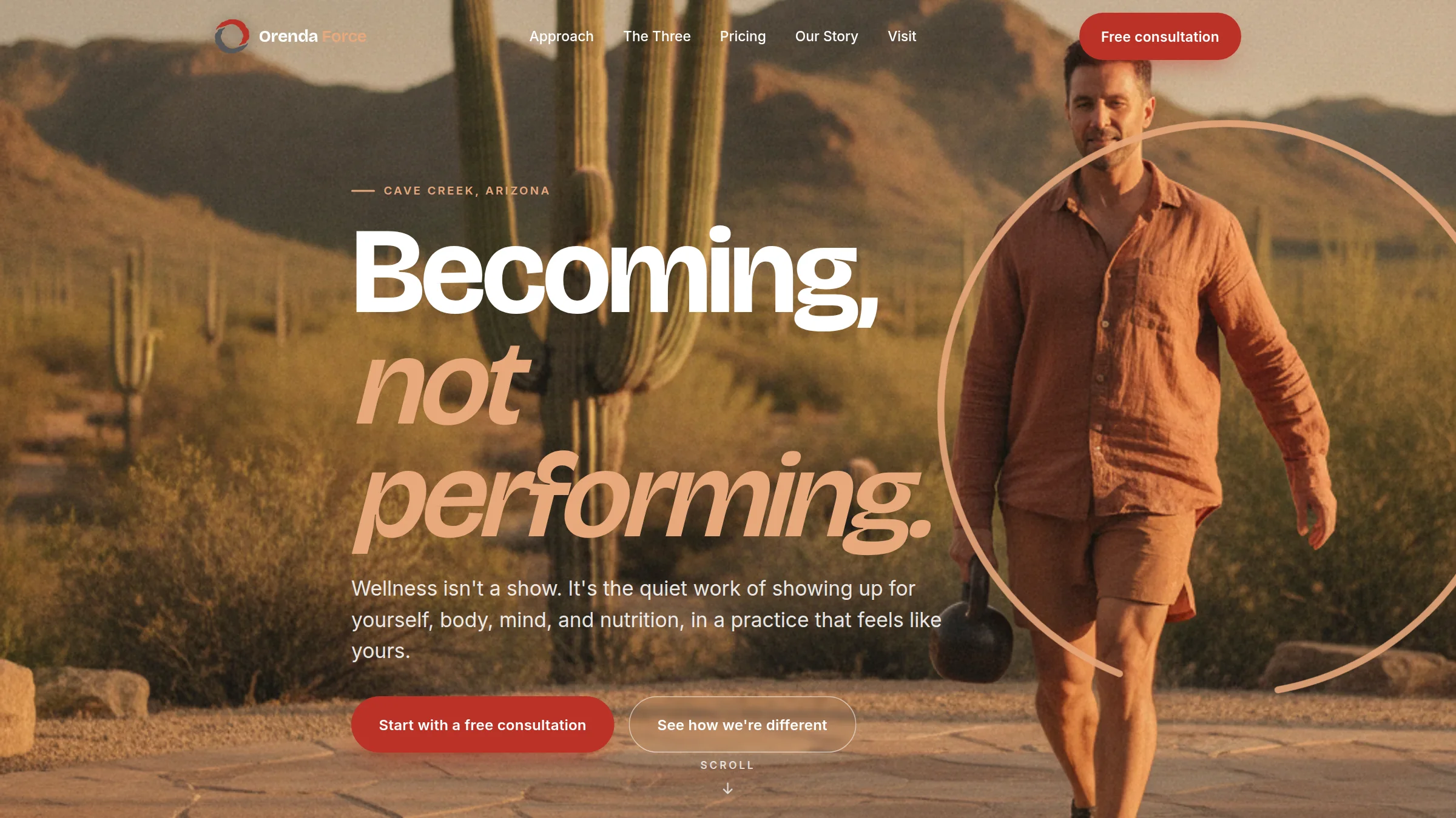
A Cave Creek wellness studio was doing something nobody else does, training, nutrition, and mind-performance under one roof, on a site that looked closed since 2016. We built a warm desert identity around its own enso logo, so the practice finally looks as whole as it is.
How this one came together
Orenda Force is the only practice in the Cave Creek corridor that brings personal training, nutritional coaching, and mind-performance therapy under one roof. It is owner led, priced honestly from $19 a session, and rooted in its own community. None of that came through on a website frozen since 2016, which quietly told visitors the business might not even be open.
We started from the one thing already right: their logo, a hand-drawn enso ring. A circle is wholeness, and wholeness is the entire point of the practice, so we made the ring the spine of the site. It opens the hero, it assembles from three colored arcs into a single "one practice" mark, and it carries through to the footer. The palette is drawn straight from the Sonoran desert around them, terracotta, saguaro green, and adobe white, a warm and human direction in a category full of black gyms and neon. The owner did not want a serif, so the headlines use a confident modern grotesque instead.
Every section earns its place: the integrated three-pillar model, transparent pricing shown with pride, the founders story, and a free consultation as the clear front door. We generated warm golden-hour desert imagery to set the tone until their own photography is ready, wrote the copy in a grounded voice with no hustle and no hype, and built it as a fast static site with the SEO foundation the old one never had. The result is a practice that finally looks as considered as the care it offers.